UX Case Study
Dammy's Daycare —
Building Trust Through
Thoughtful Web Design
Designing a warm, trustworthy, and informative website that helps parents confidently choose a daycare for their children.
Role
UI/UX Designer & Web Designer
Platform
Web
Project Type
Business Website
Focus Areas
UX Design, UI Design, Responsive Design
Project Overview
A digital home for families who care
Dammy's Daycare needed a modern website to help parents easily learn about their childcare services and feel confident about the environment their children would be in.
Many daycare centers rely on word-of-mouth or outdated websites that fail to clearly communicate their services, safety measures, and learning environment. The goal of this project was to design a welcoming digital experience that builds trust with parents while clearly presenting the daycare's offerings.
The final result is a responsive and user-friendly website that helps parents quickly understand the daycare's programs and easily get in touch.
The Problem
Parents struggle to trust what they can't clearly see
Parents searching for daycare services often face poorly designed websites that lack essential information—creating uncertainty and making it harder to trust a provider.
Lack of Clear Information
Daycare websites rarely communicate services, safety measures, or learning environment effectively.
Limited Visual Presence
Minimal or low-quality visuals of facilities fail to build the visual trust parents need.
Confusing Navigation
Poor information architecture on existing sites makes it hard to find critical details.
Difficult to Contact
Parents struggle to quickly reach the daycare for enrollment inquiries or questions.
The challenge was to create a website that feels safe, welcoming, and trustworthy while presenting information in a clear and accessible way — bridging the emotional gap between a parent's concern and a daycare's credibility.
Goals
Design objectives
Four core principles guided every design decision made throughout this project.
Create a warm and welcoming digital presence that reflects the daycare's nurturing environment
Structure information clearly so parents can quickly understand the services offered
Make it easy for parents to contact the daycare or ask questions
Ensure the website works smoothly across mobile, tablet, and desktop devices
Target Users
Who are we designing for?
Primary User
Parents
Parents looking for a safe and reliable daycare for their children — typically conducting research on mobile devices, often under time pressure, and making emotionally significant decisions.
User Needs
What they need
- Trust and reassurance about childcare quality
- Easy access to information about programs and services
- Clear contact information
- Visual confirmation of the daycare environment
Research Insights
What the research revealed
Trust is built through transparency
Parents prioritize trust and transparency when choosing a daycare. Visual elements such as photos of the facilities help build credibility, while clear descriptions of services make decision-making easier.
Mobile is the primary research channel
Many parents browse websites on their phones, making mobile responsiveness a critical part of the design — not an afterthought.
Information Architecture
Structured for clarity
To make navigation simple and intuitive, the website structure was organized into clear sections — ensuring parents can quickly find information without unnecessary complexity.
Main Navigation
This flat, five-item structure ensures parents can locate the information they need in a single click — reducing cognitive load and improving conversion to the contact page.
Design Approach
Three principles drove every decision
Warm Visual Language
The design uses friendly colors, welcoming imagery, and clean typography to reflect a nurturing childcare environment.
Clear Content Layout
Information is organized into clear sections with generous spacing to make the content easy to read and scan.
Mobile-First Thinking
The layout was designed to work seamlessly on smaller screens, ensuring parents can browse comfortably on their phones.
Key Screens
The final interface
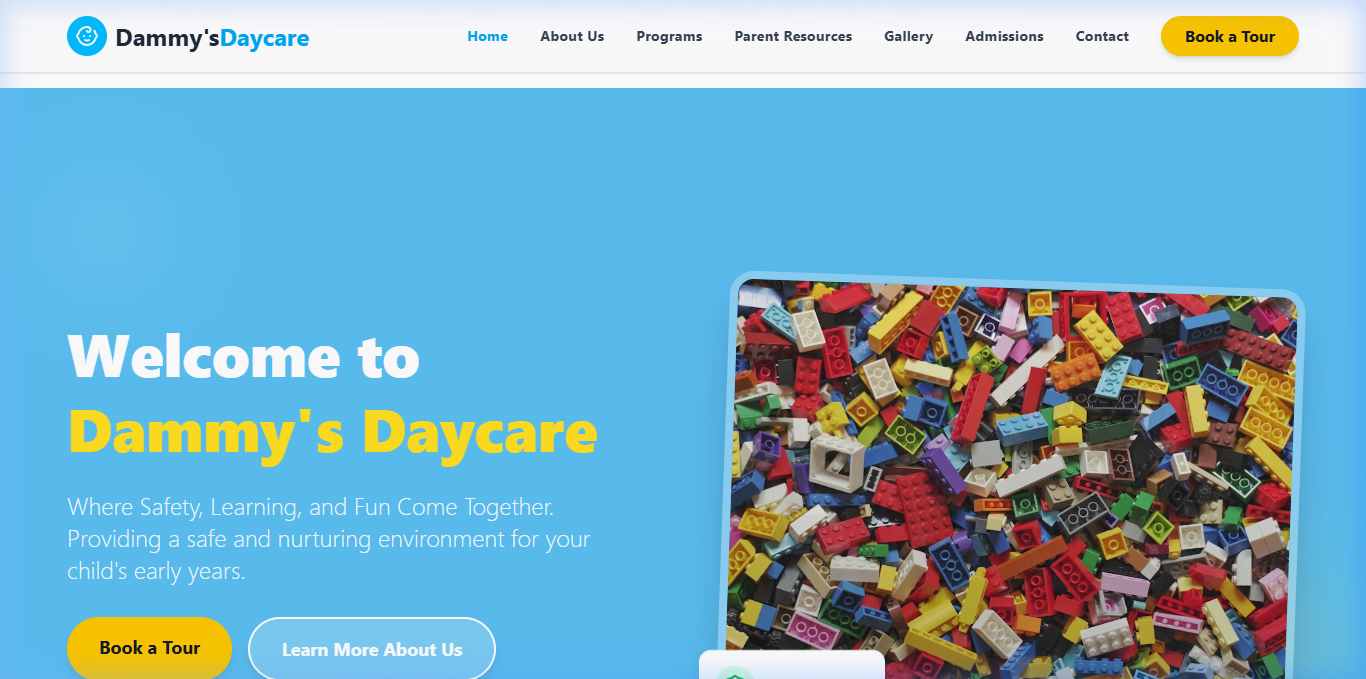
01 — Hero
Homepage
The homepage introduces the daycare with welcoming visuals and clear messaging about the services offered.
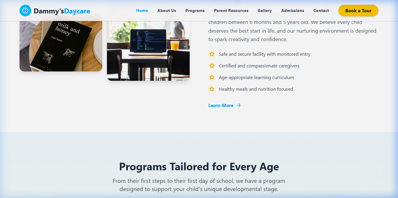
02 — Programs
Programs Section
This section clearly explains the daycare programs and services available to parents across all age groups.
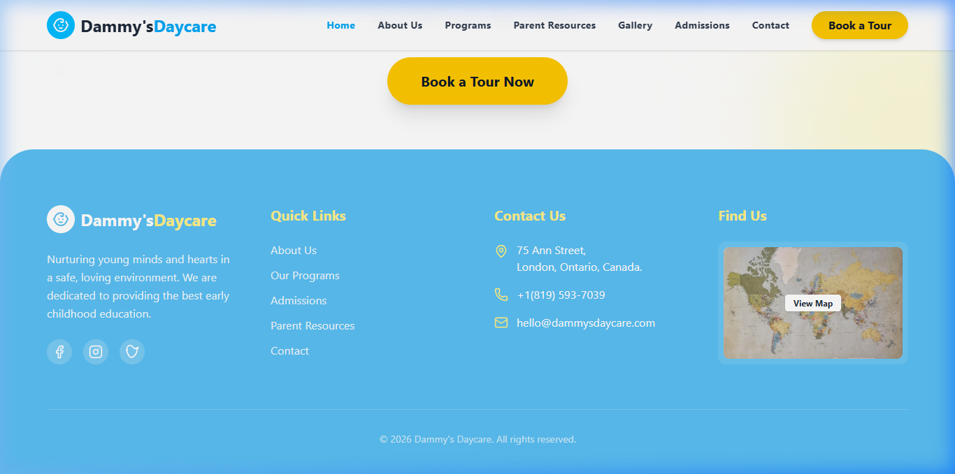
03 — Contact
Contact Section
A simple and accessible contact area allows parents to quickly reach the daycare for inquiries or enrollment information.
Challenges
What made this hard
Building Trust Through Design
Because parents are making an important decision about their children, the website needed to feel trustworthy and professional while still being warm and approachable — a delicate emotional balance that required careful calibration of color, typography, and imagery.
Simplifying Information
Balancing enough information without overwhelming visitors required careful structuring of content and layout — using progressive disclosure, clear visual hierarchy, and concise copywriting to guide parents through the decision-making process.
Outcome
A website families can trust
The final design delivers a clean and welcoming website that clearly communicates the daycare's services while helping parents feel confident in their decision.
"The result was a modern, responsive website that gives Dammy's Daycare a credible digital presence — helping parents make confident decisions and helping the business grow through better first impressions."
Reflection
What I learned
This project highlighted how important emotional trust is when designing for services involving children and families. Good design in this context isn't just about aesthetics — it's about creating a sense of safety and reliability before a single word is read.
The design approach focused not just on aesthetics, but on creating a user experience that reassures parents and helps them make informed decisions. Every color, spacing choice, and content structure served that core goal.
Future Improvements
What comes next
See More Work
Interested in working together?
I'm available for freelance projects and full-time roles. Let's build something great.